Une marque logicielle de confiance, globale et axée conformité. kShuttle réunit pilotage de la performance financière et durable avec des solutions certifiées et sécurisées.A trusted, global and compliance-driven software brand. kShuttle unites financial and sustainability performance management with certified and secure solutions.
Alors que la réglementation extra-financière se durcit (CSRD, Taxonomie), les organisations ont besoin d'un outil de confiance. L'enjeu : faire d'une plateforme ESG exigeante une marque claire, crédible et prête à convaincre à l'international.As extra-financial regulation tightens (CSRD, Taxonomy), organisations need a tool they can trust. The challenge: turn a demanding ESG platform into a clear, credible brand ready to convince on the international stage.
Mon rôleMy role
En charge du rebranding complet de kShuttle : refonte du logo, système de marque, charte couleurs & typographie, et kit de présentation commercial.Senior designer leading kShuttle's full rebranding: logo redesign, brand system, colour & type guidelines, and the sales presentation kit.
Les défisThe challenges
Faire évoluer la marque pour :Evolve the brand to:
Passer du reporting RSE au pilotage de la performance extra-financièreMove from CSR reporting to extra-financial performance management
Rester crédible, conforme et auditableStay credible, compliant and auditable
Unifier une famille de produits sous une même identitéUnify a product family under one identity
Mon approcheMy approach
Partir du picto comme brique fondatrice : une alvéole hexagonale et une flèche de données, déclinées en un système graphique complet : couleurs, typographie, éléments et gabarits de slides — pour une marque immédiatement reconnaissable et extensible.Start from the mark as the founding block: a hexagonal cell and a data arrow, expanded into a complete graphic system — colours, typography, elements and slide templates — for a brand that is instantly recognisable and scalable.
Le contexteThe context
Du simple reporting RSE au pilotage de la performance extra-financière.From simple CSR reporting to steering extra-financial performance.
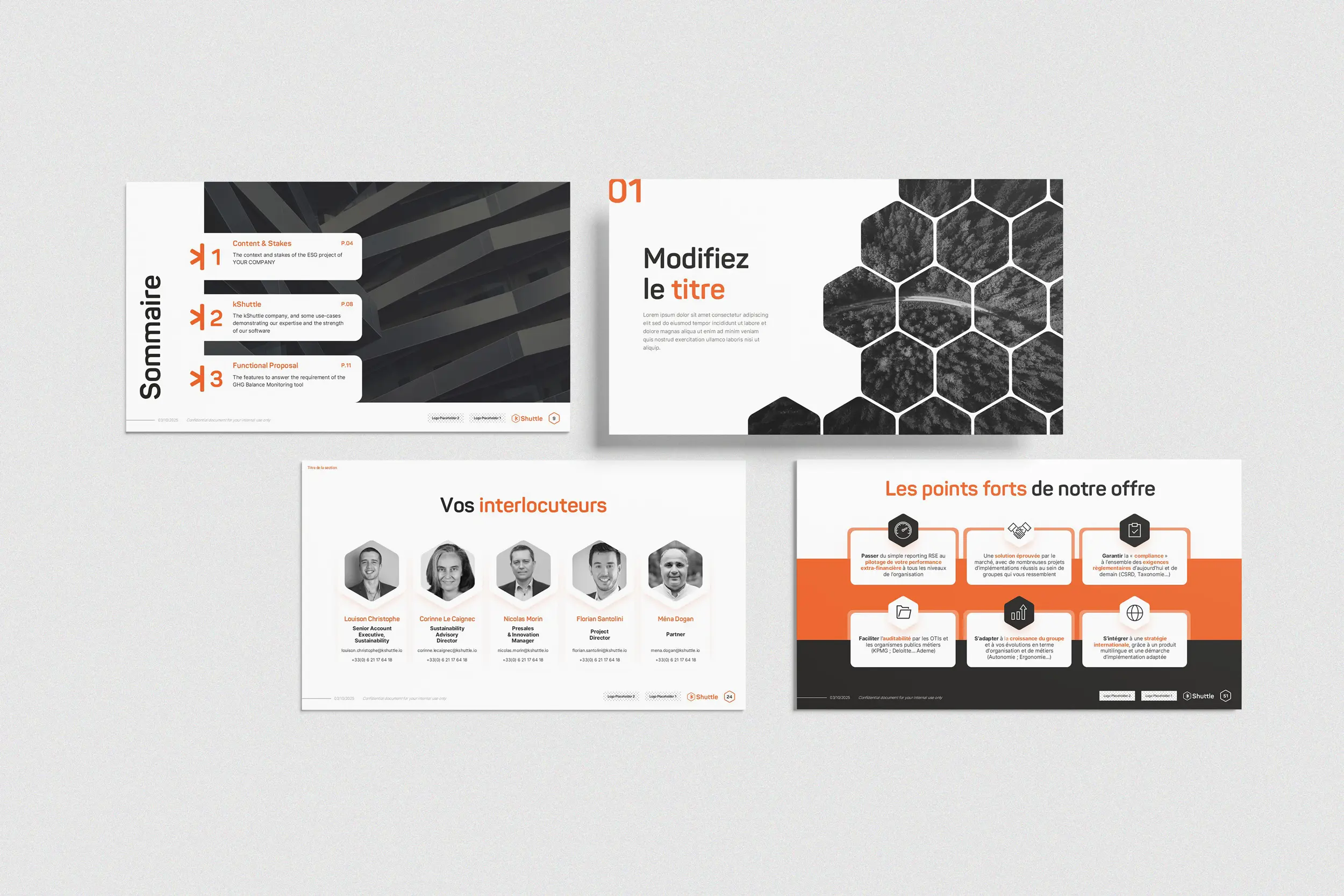
La promesse de marque devait porter une offre exigeante : une plateforme ESG éprouvée, conforme et auditable, capable de suivre les organisations à mesure que la réglementation CSRD, Taxonomie se durcit. Six points forts structurent le discours.The brand promise had to carry a demanding offer: a proven, compliant and auditable ESG platform, able to follow organizations as regulation — CSRD, Taxonomy — tightens. Six strengths structure the narrative.
01
Piloter, pas seulement reporter : passer du reporting RSE au pilotage de la performance extra-financière, à tous les niveaux de l'organisation.Steer, don't just report — move from CSR reporting to extra-financial performance management, at every level of the organization.
02
Une solution éprouvée par le marché, avec de nombreux projets d'implémentation réussis au sein de groupes qui vous ressemblent.A market-proven solution, with many successful implementation projects within groups like yours.
03
Garantir la compliance à l'ensemble des exigences réglementaires d'aujourd'hui et de demain (CSRD, Taxonomie…).Guarantee compliance with all current and future regulatory requirements (CSRD, Taxonomy…).
04
Faciliter l'auditabilité par les OTI et les organismes publics métiers (KPMG, Deloitte, Ademe…).Ease auditability by third-party bodies and public agencies (KPMG, Deloitte, Ademe…).
05
S'adapter à la croissance du groupe et à vos évolutions d'organisation et de métiers (autonomie, ergonomie…).Adapt to the growth of the group and to your organizational and business shifts (autonomy, ergonomics…).
06
S'intégrer à une stratégie internationale, grâce à un produit multilingue et une démarche d'implémentation adaptée.Fit an international strategy, thanks to a multilingual product and a tailored implementation approach.
L'identité — Le logoIdentity — The logo
Une alvéole, une étoile, une flèche.A honeycomb cell, a star, an arrow.
Le picto enferme un « k » dans un hexagone : l'alvéole de la ruche. Les deux branches de l'étoile dessinent une flèche de mouvement et d'échange de données ; la partie gauche conserve une transparence de 30 %. Un système d'espaces de sécurité calé sur la hauteur de l'hexagone protège sa lisibilité, du favicon 32 px aux grands formats.The mark locks a "k" inside a hexagon — the beehive cell. The two branches of the star draw an arrow of movement and data exchange; the left side keeps a 30% transparency. A clear-space system based on the hexagon's height protects legibility, from the 32 px favicon to large formats.
L'alvéole hexagonaleThe hexagonal cell
Métaphore de la ruche : des produits autonomes qui se connectent dans un même écosystème.A hive metaphor: autonomous products that connect within one ecosystem.
Les branches → flècheBranches → arrow
Deux branches de l'étoile forment une flèche : transmission, flux, mise en mouvement de la donnée.Two star branches form an arrow: transmission, flow, data set in motion.
Le « k » de KshuttleThe "k" of Kshuttle
La lettre-signature, tracée en Panton, ancre la marque mère au centre de la famille.The signature letter, drawn in Panton, anchors the parent brand at the heart of the family.
Les couleursColors
L'orange, clé de voûte de la communication.Orange, the keystone of the communication.
L'orange Kshuttle s'utilise en priorité, à 100 % sur l'essentiel du logo et à 30 % sur la partie gauche du picto. Une déclinaison en dix teintes étend la palette. Des neutres chauds laissent toute la place à la couleur principale.Kshuttle orange comes first — 100% across most of the logo, 30% on the left of the mark. A ten-step tint scale extends the palette, while warm neutrals leave the spotlight to the primary color.
Titres & éléments mis en avant. Ses formes géométriques aux contours arrondis rappellent l'univers du logo et démarquent la marque.Titles & highlights. Its rounded geometric forms echo the logo's universe and set the brand apart.
Aa
Inter // Tous typesAll purposes
ABCDEFGHIJKLMNOPQRSTUVWXYZ 0123456789
Textes courants. Conçue pour les interfaces, optimisée pour la lisibilité des petites et moyennes tailles à l'écran.Body copy. Designed for interfaces, optimized for small-to-medium on-screen legibility.
Éléments graphiquesGraphic elements
Trois signes issus du picto.Three signs drawn from the mark.
Décomposé, le logo offre une boîte à outils graphique déclinable sur tous les supports de communication.Broken down, the logo becomes a graphic toolkit that flexes across every communication support.
L'alvéoleThe cell
L'hexagone, cadre et trame.The hexagon, frame and grid.
La lettre-signature de Kshuttle.Kshuttle's signature letter.
Système de slidesSlide system
Le système se prolonge dans un kit de présentation : trame hexagonale, photos en noir & blanc et aplats orange, prêt pour les propositions commerciales ESG.The system extends into a presentation kit: hexagonal grid, black & white photography and orange blocks, ready for ESG sales proposals.
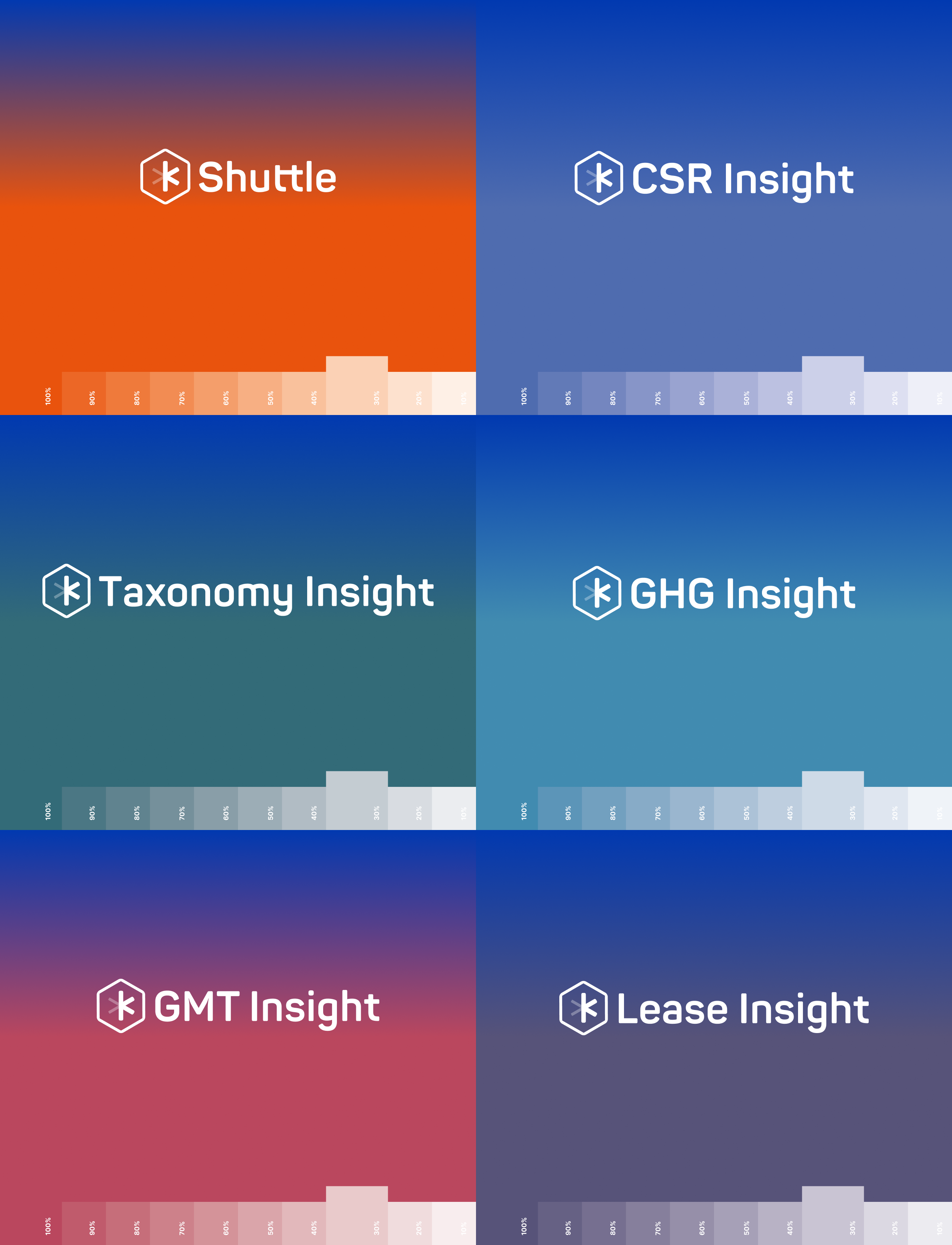
Une marque globale avec une famille de solutions. Kshuttle propose des produits spécialisés, chacun avec sa propre identité, tous alignés pour accompagner reporting, conformité et croissance durable.A global brand with a family of solutions. Kshuttle delivers specialized products, each with its own identity, all aligned to support organizations in reporting, compliance and sustainable growth.
Les déclinaisonsThe declensions
Des alvéoles connectées, comme dans une ruche.Cells connected, like in a hive.
Le picto Kshuttle reste orange, au centre. Autour, chaque produit hérite de la forme et reçoit sa propre couleur : une identité dérivée qui reste immédiatement reconnaissable comme membre de la famille.The Kshuttle mark stays orange, at the center. Around it, each product inherits the shape and takes its own color — a derived identity that still reads instantly as part of the family.
kShuttle
#F15F22
Taxonomy Insight
#346C78
GHG Insight
#428BAD
CSR Insight
#4D70B0
Lease Insight
#54567A
GMT Insight
#B54E64
Le résultatThe outcome
UNE MARQUE QUI PILOTEA BRAND THAT STEERS
Une identité hexagonale cohérente, lisible du favicon aux grands formats et extensible à toute la famille de produits : un système de marque prêt pour les propositions commerciales ESG à l'international.A coherent hexagonal identity, legible from favicon to large formats and extensible across the whole product family — a brand system ready for international ESG sales proposals.
RéalisationsDeliverables
CE QUI A ÉTÉ LIVRÉWHAT WAS DELIVERED
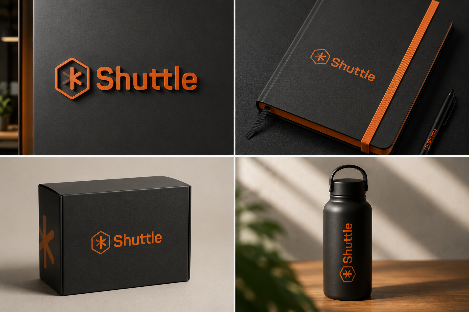
Refonte de l'identité de marque et système visuel pour une famille de produits, déclinés sur les supports et présentations.Brand identity redesign and visual system for a product family, applied across collateral and presentations.
BrandingCharte graphiqueBrand guidelinesFamille de logosLogo familySystème visuelVisual SystemSlidesB2B SaaS